Branding for a family-owned neon studio.
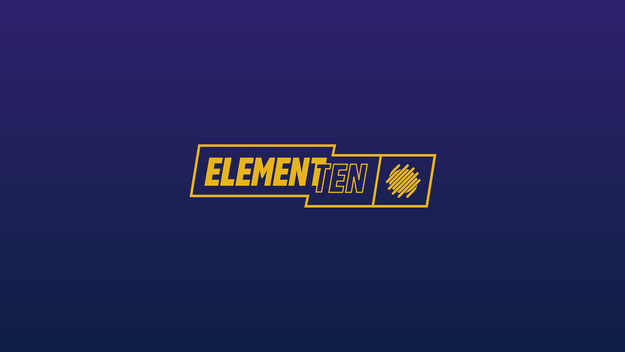
ELEMENT TEN
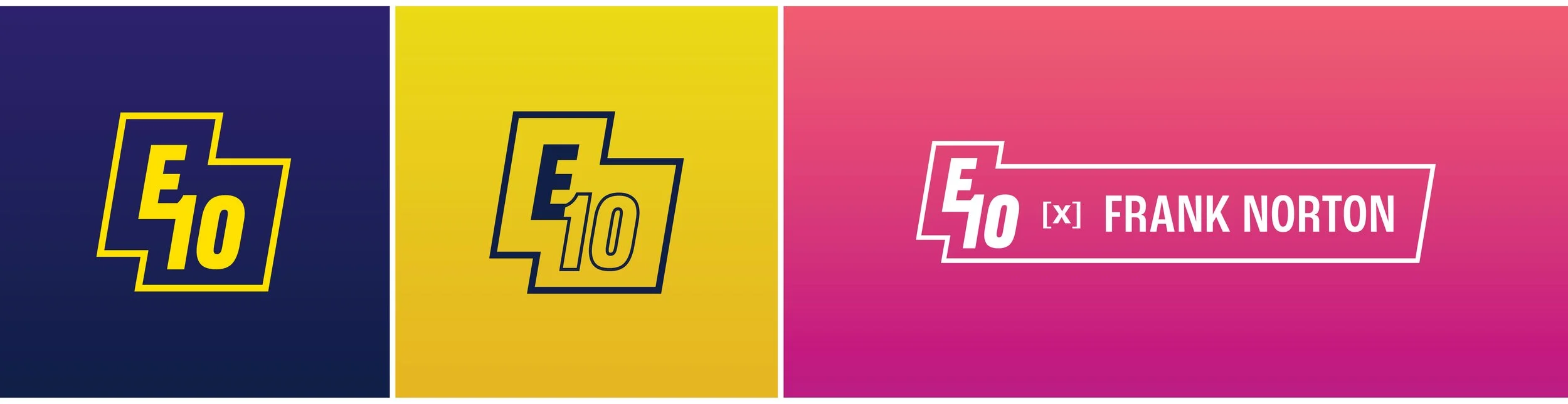
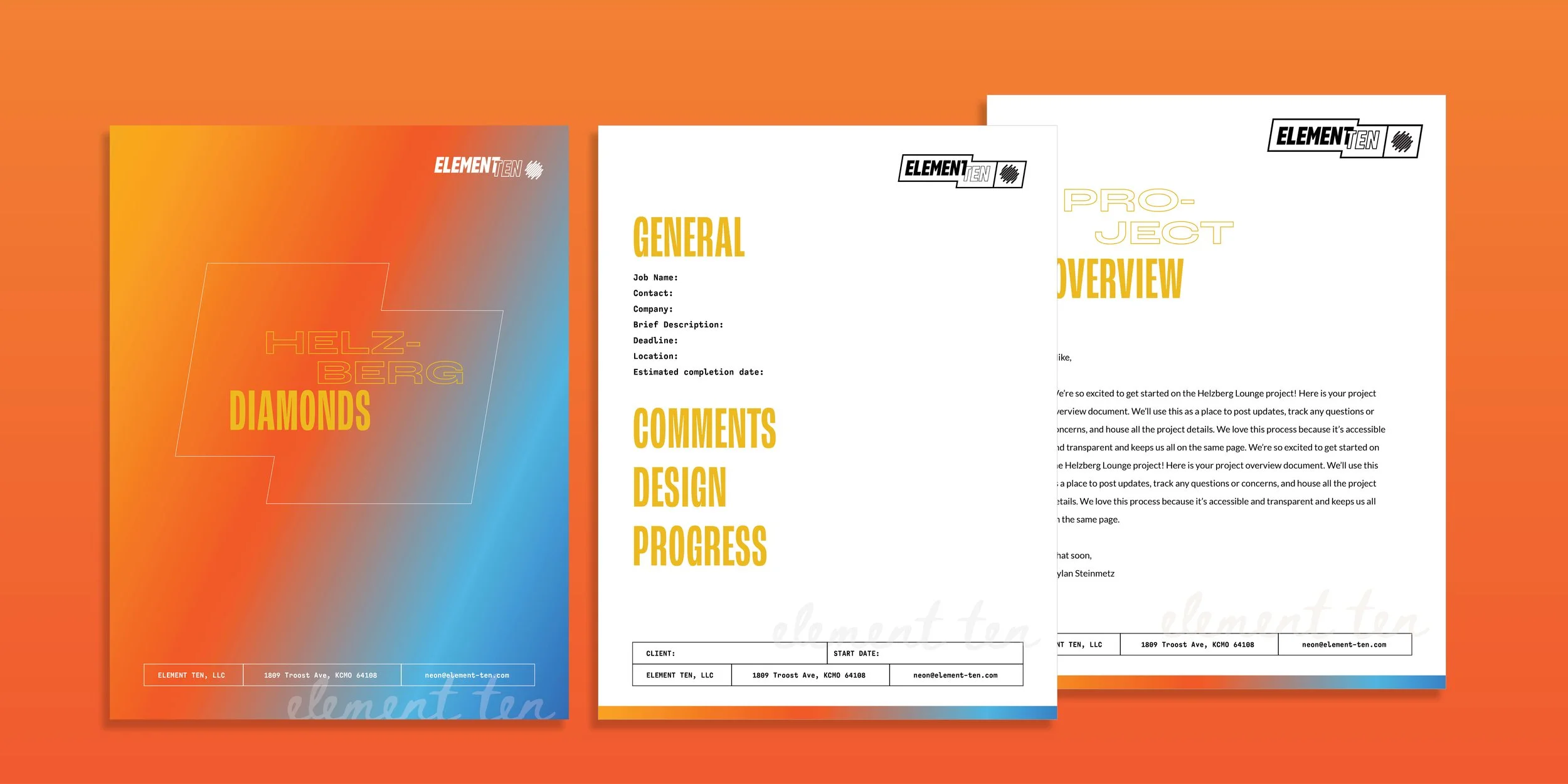
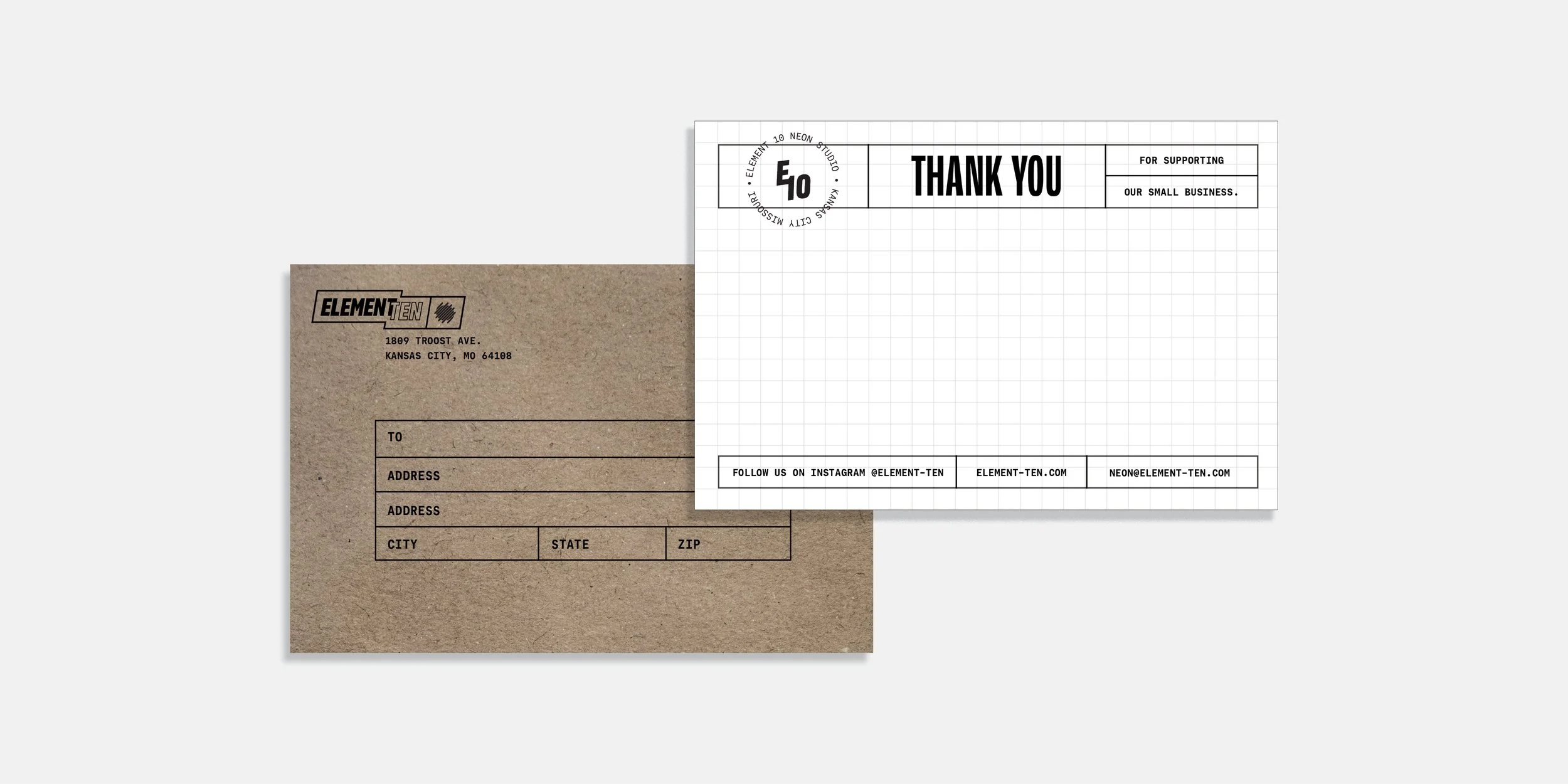
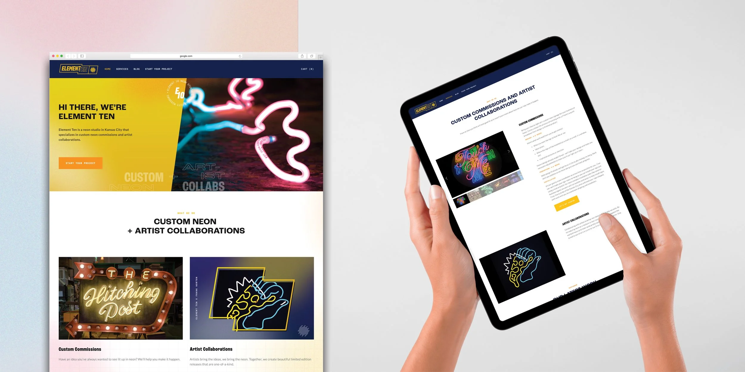
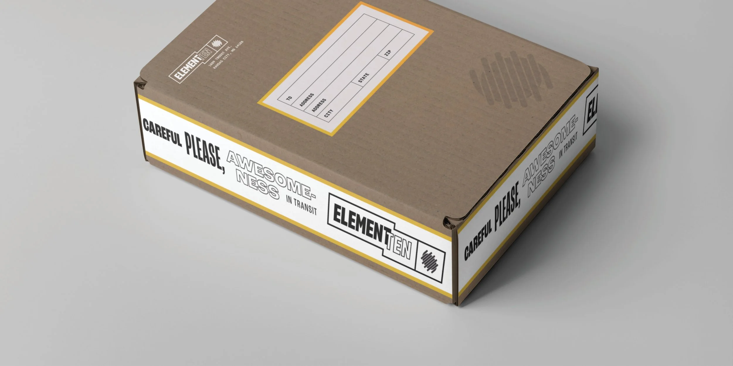
Element 10 has been a staple in the KC neon scene for years. They love their name and parts of their original logo, so I came in to make a few tweaks and expand their branding to reflect where the company is headed in the future. We needed the branding to work extra hard for us - be bold and bright, just like the medium itself but not overwhelming, and not lose the tactile and hard working elements that hide in the details of neon bending. I worked with Olivia + Dylan on small logo updates, a full branding package, art direction for the future, strategizing their social presence and making website updates for now and in the future.
BRAND DEVELOPMENT | ART DIRECTION | STRATEGY | DESIGN